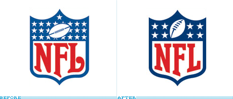
Good identity redesigns
Good identity redesigns
Out of context: Reply #13
Started
Last post
23 Responses
radar
0
radar
0
Permalink
Upvote
Downvote
Flag
not web 2.0 enough. needs more shiny
734
+1 Its a simple improvement
Iggyboo
The logotype doesn't sit right inside the shield. I would've gone w/ a simpler, less curvy shield to match the squared-off letterforms.
gramme
...letterforms.
gramme
Show [[ numHiddenNotes ]] more notes
Add Note
Save
Cancel
View thread
Prev
Next
Prev
Next
Log in
Register
Broadcast
Filter
Jingle
Made with
❤
by Krop
Build a Portfolio Website